How long has Baseball been rumored to be moving to Portland? Almost as long as Oregonians have been complaining about Californians moving here and ruining everything. That’s why when a Portland creative agency invited Tim Weakland (graphic design), Brandon Hrycyk (illustration and graphic design) and myself to imagine what a future Portland Professional Baseball team would look like we only had one answer: The Portland Californians!
We had a lot of fun with the Californians branding exercise being mindful to zig, when we assumed other participants would zag… and we were right. At the event there were no lack of Pacific Northwest tropes, color sets, and critters. The Californians stood out from the crowd and got a bunch of laughs. A home run in our book!
Concept Design / Strategy / Art Direction
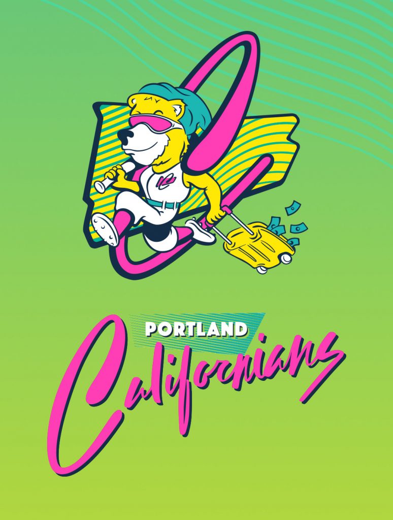
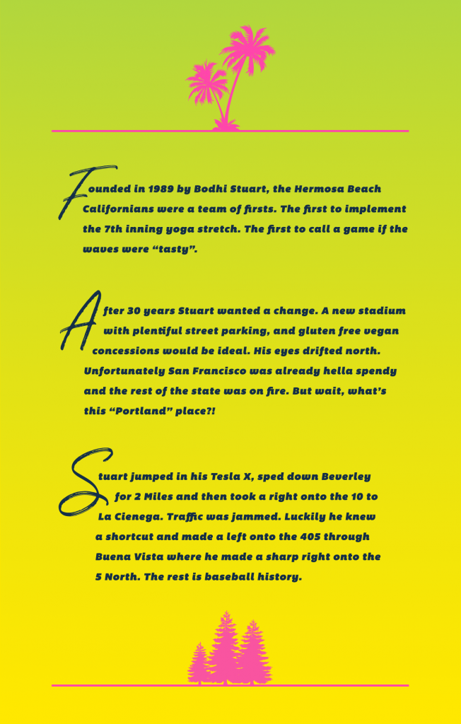
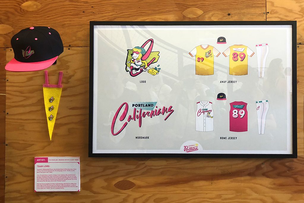
Logo and Lock Up above, and The Californians origin story below.
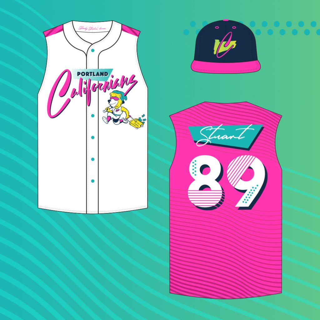
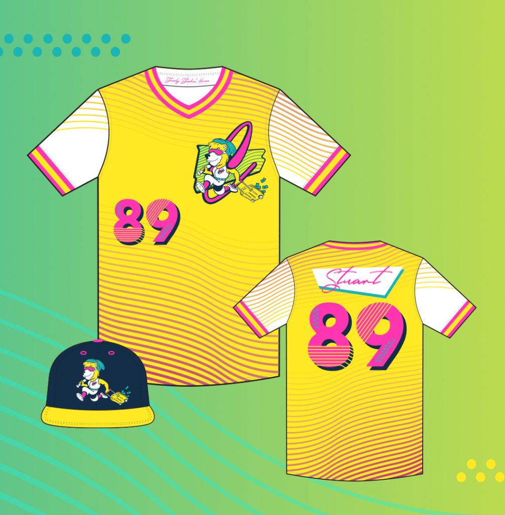
Both the Home and Away uniforms were inspired by waves, sunshine, and overly stereotypical So-Cal graphics, colors and “vibes”. I mean, why would a team originally from Hermosa Beach have sleeves on their home jersey?
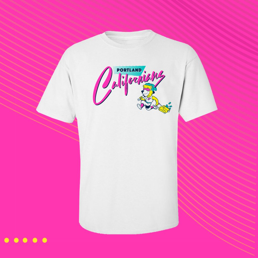
Above is the presentation of our Californians package at the MLB to PDX event. Unfortunately we didn’t get final sign-off on the cap and pennant. We did however make some tees (below).
